22 Mar 2024 - 05 Jun 2024 (week 6 ~ week 7)
Shim Yi Xun || 0363292
Bachelor of Design (Honours) in Creative Media
Advanced Typography GCD 61004
Task 2 - Key Artwork & Collateral
Content Jumplink
Class
Summary
WEEK 5
Mr. Vinod sir conducted a quick online feedback session for our
Task 2(A) as it was a public holiday. He said that once our key
artwork is complete, we can explore and pick a colour palette for
it.
WEEK 6
After completing Task 2(A), you may move on to Task 2(B).
Identify 3 collaterals (T-shirt, Tote Bag, etc.) and expand your
key artwork into your chosen collateral.
WEEK 7
Complete Task 2 (A+B) eportfolio. Prepare Task 3 presentation in
Google Slides or PPT as soon as you can, explain your intention,
show examples and make an attempt at a design.
Lectures
05💬 Perception & Organisation
Instruction
Task 2(A) / Key Artwork
Explore and create your name in wordmark/monogram form. The final key
artwork must be an elegant solution, balanced and organized, not
complex or chaotic, resulting in a functional and communicative key
artwork.
WEEK 5
These are my attempted sketches. I tried different styles to
explore their potential, because we not only want to express our
personality style through these wordmarks, but we also had to
think about whether these designs will be attractive and unique
when it comes to peripheral products.

|
|
Fig 1.1 Wordmark Sketches
|
Then I picked the preferable designs and digitised them.

|
|
Fig 1.2 Wordmark Digitization
|
|
In the feedback session, Mr. Vinod said that readability is important
to make the viewers able to identify the name at their first sight,
otherwise, they would be confused as to what the word was.
WEEK 6
I decided to go on with no.4, which is the modular. I intentionally
made rounded edges for each letter because I wanted to create a
slightly softer feel within this rigid module. But the rounded edges
of the "I" should be redesigned because even though I was making the
rounded edges feature for each letter, it looked unbalanced and
awkward.

|
|
Fig 2.1 Wordmark Version 1.0
|
I first tried to make the "I" become more thicker. Looks a lot better, but still not up to my expectations.

|
|
Fig 2.2 Wordmark Version 2.0
|
|
So I determined to forego the rounded edge features. Because I can
also maintain a soft feel when choosing the colours. Flat edges do look much better compared to rounded edges.

|
Fig 2.3 Wordmark Version 3.0
|
In physical class, Mr. Vinod asked us to print out our wordmark with
the sizes of 1024*1024mm & 15*15mm. Mr. Vinod advised me to pay
attention to the alignment of the strokes of each letter.

|
Fig 2.4 Printout
|
Back to my digitization, I aligned these letters and ensured they
were all the same width.

|
Fig 2.5 Wordmark Version 4.0
|
|
In Task 2(B), we had to make a collateral and identity expansion of
our wordmark.
WEEK 7
Colour Palette
I first explore the colour palette for my key artwork.
Since the meaning of my wordmark design is mild but brave,
I wanted to find a soft colour palette to balance both of
them. But the colour should not be soft enough like pastel
as Mr Vinod said do not use this kind of
colour.
This is the first version of my wordmark colour:

|
|
Fig 3.1 Wordmark Colour Palette
Version1.0
|
|
However, Mr Vinod said the yellow colour is a bit dangerous
due to the white background. And the colour used is too
limited and seems somewhat monotonous. Therefore, I have to
explore more colours.
The second version of my wordmark colour:

|
Fig 3.2 Wordmark Colour Palette Version2.0
|
|
Collateral
After deciding on the colours, this was the part where we needed to
expand our wordmark and create a series of visual identities. This was
the hardest part as my wordmark lacks of characteristics, so I had to
explore the essentials which can be expanded upon in my
wordmark.
I attempted to start with the 'S', and I tried to zoom in, zoom in,
and zoom in. I slightly changed one of the stroke colours so that it
would not look dull.
Then, I adjusted the stroke placement and made it repeatedly. And this
is what it looks like:

|
Fig 3.4 Expansion
|
Mockup
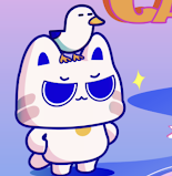
Move on to mockup, I decided on my mockup items which are:
1. Tote bag
2. T-shirt
3. ID card
4. Phone case
I additionally designed some versions that combined with the symbol and
colour switch.

|
Fig 3.5 Expansion
|
Mockup attempting.

|
Fig 3.6 Mockup
|
Insta Layout & Design
Planning for Insta layout design:

|
Fig 3.7 Insta Layout Organisation
|
Animation

|
|
Fig 3.9 Key Artwork Animation (GIF)
|
|
Task 2(A) Final Outcome:

|
Fig 4.0 Black Wordmark with White Background
|
|

|
Fig 4.2 White Wordmark with Black Background
|
|

|
Fig 4.4 Wordmark in actual colour on lightest
shade of colour palette
|
|

|
|
Fig 4.5 Wordmark in lightest shade of colour
palette on darkest shade of colour palette
|
|
Task 2(B) Final Outcome:

|
|
Fig 4.7 Collateral - Shirt
|
|

|
Fig 4.8 Collateral - Tote Bag
|
|
|

|
Fig 4.9 Collateral - Phone Case
|
|
|

|
Fig 4.11 Instagram Screen Grab
|
|
|
Fig 4.12 Task 2 Final Outcome PDF
|
|
Feedback
WEEK 5
General
The keyword cannot be a derogatory term, as it will leave a bad impression.
Specific
The workmark must have readability. Redefine your workmark.
WEEK 6
General
The workmark must have readability and be easy to identify.
Specific
Try to keep the edges of your wordmark from being rounded, as the rounded edges make the letters look unbalanced. Notice the alignment between the letters.
WEEK 7
General
Explore and research more about how to expand your design.
Specific
Since you are working on only two colours this will lead you to a limited scope of expansion, so you have to explore more colours.
Reflection
Experience
This task was a big challenge for me because it required a series of image designs. There are many factors to consider, especially the expansion part. How to make good use of the characteristics of your own design and expand them is really troublesome.
Observation
In this task, I learn how to explore and design self-identity. It’s not just about design, it also has to consider many aspects, such as the choice of colour, what characteristics and personality which I want to bring out in this wordmark, and subsequent expansion, etc.
Findings
Design requires balancing creative expression
with practical considerations. While it is
important to push the boundaries of
creativity, the design must also be
functional, versatile, and able to withstand
the demands of real-world application and
expansion.
Further
Reading

|
|
I.D.E.A.S. by David Creamer
|
Serif
Common text or body copy font. They can come with three sub-categories, as follows:
1) Oldstyle
Based on classical Roman inscriptions. The letters are slightly wider between each other and the stroke thickness is contrasting.
2) Modern
They are more mechanically faultless than Oldstyle
fonts, clearly distinguishing between heavy/light
strokes and thin/square serifs.
3) Square Serif
Slab Serifs are a modern style that is primarily used
for little pieces of text, such as advertisement copy,
subheadings, and headlines. The letters include square
serifs and largely consistent strokes with little
distinction.
Sans Serif
As its name suggests, Sans Serif fonts lack serifs
and typically have uniform stroke weights, so there
is minimal distinction between the letters. This
kind of font can evoke a more modern look for a
report, however, it can be harder to read than Serif
fonts.
Display
The purpose of display and decorative typefaces
is to serve as visually striking headline fonts.
Font Styles
Many script, display, and text typefaces are only
available in their naked form; even after styling
has been applied, they still seem bold or italic.
Some fonts only come in plain and bold versions,
plain and italic versions, or plain, bold, and
italic variants, which further complicates the
situation.
Font Families
Fonts with the same design but different weights
are called "font families". In order from the
lightest to heaviest, as follows:
- Extra Light / Ultra Light / Extra Thin
- Thin / Light
- Roman / Book
- Medium / Regular
- Demi-Bold / Semi-Bold
- Bold
- Heavy / Extra Bold / Super Bold
Some fonts may even have matching condensed and
extended version too.
Underlining
The underlining ought to be lowered and stay away
from the characters.


.png)
Comments
Post a Comment